

When Hotpod Yoga approached us ahead of their brand relaunch, they needed a reliable and agile partner to help bring their refreshed identity to life.
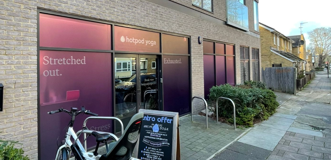
With a tight timeline and multiple new locations preparing to open, the challenge was clear: translate a vibrant new brand across a wide range of printed media - quickly, accurately, and consistently.
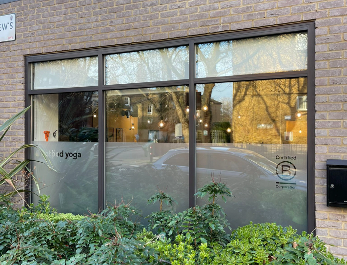
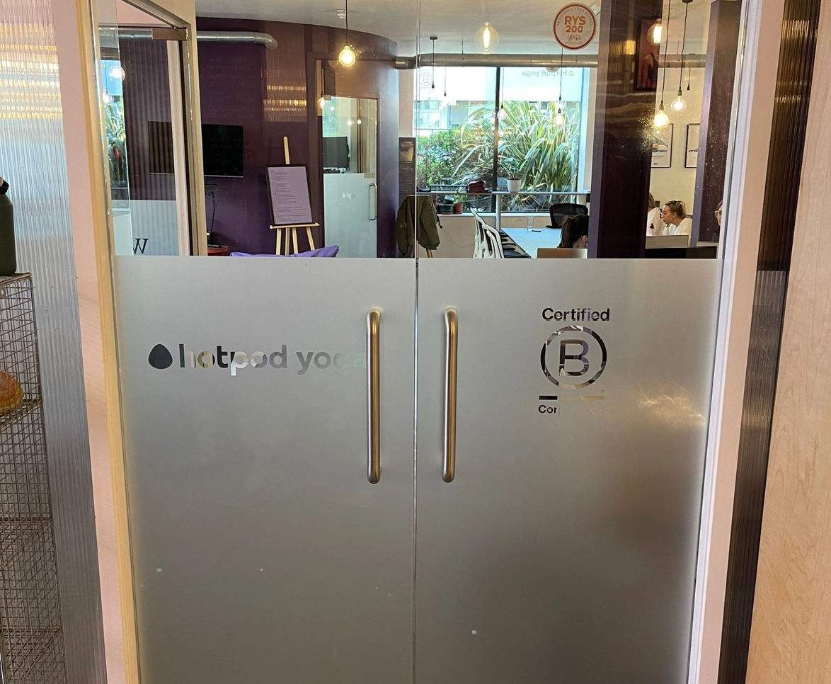
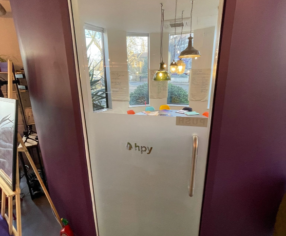
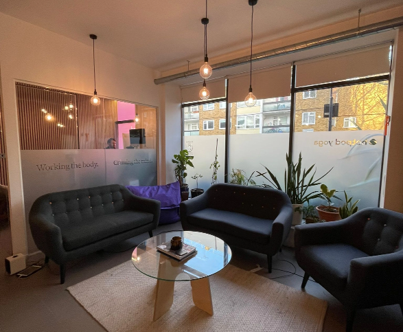
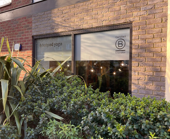
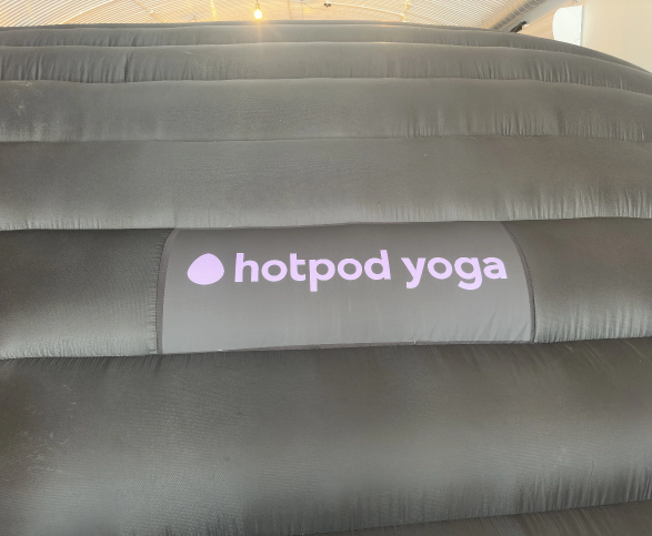
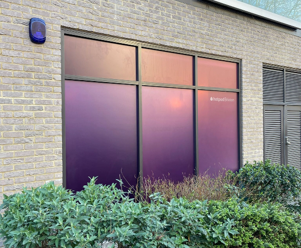
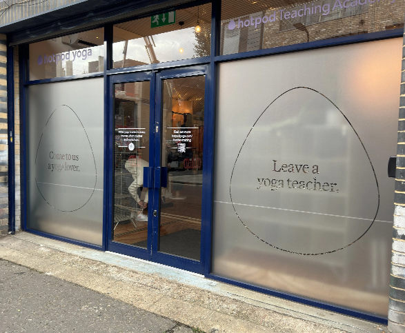
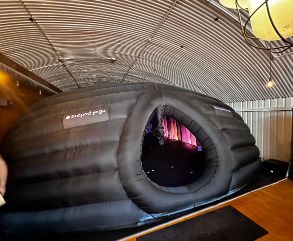
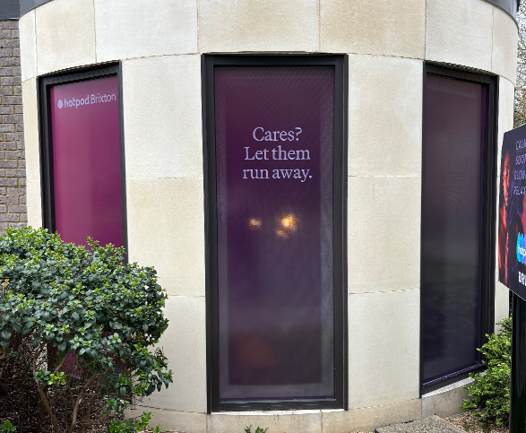
Our team was brought in to manage the physical expression of Hotpod Yoga’s new look across two key store openings. From large-format graphics to window vinyls, signage and inflatable branding, the project required a sharp focus on colour fidelity and material quality.
One of the most critical elements of this project was colour matching. The new Hotpod Yoga palette was bold and modern, and maintaining consistency across different print substrates and lighting environments was essential. We conducted thorough colour testing across materials including vinyl, board, and fabric to ensure a seamless match from storefront to studio interior.
In addition to managing production, our team handled installation logistics within a compressed timeframe. Working closely with Hotpod Yoga’s internal team and other stakeholders, we ensured that everything was delivered and installed on schedule.
The result was a polished, energetic brand presence that elevated each store launch and reinforced Hotpod Yoga’s renewed identity ahead of their national rebrand.
Get in touch
Let us know what you need and we’ll show you what we can do